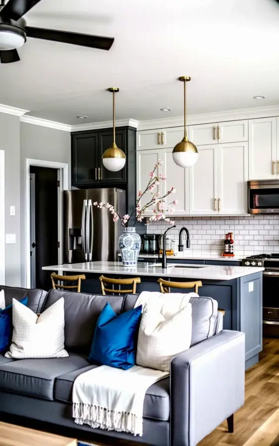
Standing in this open living room and kitchen, the first thing you likely notice is how the blue and white pillows on that gray sectional just seem to work. The pop of color against the crisp white cabinets and the soft glow from those three brass pendants pulls the whole space together without trying too hard. This is the exact balance people struggle with in a small open layout.
I have sat in too many tiny apartments and watched homeowners make the same three or four errors over and over again. They buy nice pieces, yet the room still feels off. It is not about budget and it is not about square footage. It is about a handful of specific choices that either anchor a space or sink it. Here are the five most common small living room mistakes I see, and how to avoid them using this exact spring setup as your guide.
Mistake #1: Matching Pillows and Walls Until Everything Blurs Together
People get scared of color in a small room, so they buy beige pillows for a beige sofa in a beige apartment. The result is a space that feels sterile and flat, like a waiting room. You do not need beige. You need contrast, and this photo nails that contrast with a simple formula.
The gray sectional anchors the room, but the blue and white pillows create a focal point that draws your eye forward. They are not loud, but they are deliberate. Here is the trick: pick a wall color (or cabinet color) and then choose pillows that sit opposite it on the color wheel, or at least a few shades darker and cooler than your seating.
- White cabinets plus blue pillows equals a crisp, coastal feel.
- Warm wood floors plus gray pillows keeps things neutral but soft.
- White pillows alone work, but blue adds the depth that makes the gray sofa stand out.
You want the eye to bounce around the room, not glide over a monotone surface. Small spaces actually handle bold accents better than large ones because there is less area to overwhelm.
Mistake #2: Hanging Pendant Lights at the Wrong Height
Those three brass pendants above the quartz island are doing real work in this photo. They bring warmth through the brass finish, and the white globe shades soften the light without making the room feel like a doctor’s office. But if you hang them too high or too low, they ruin the entire open concept vibe.
I once visited a friend who hung her pendants four inches above the counter. You could not see the person sitting across from her at the island. Another house had pendants floating near the ceiling, completely useless. Here is the honest rule: hang them about 30 to 36 inches above the counter surface, and if you have low ceilings like most small homes, do not be afraid to go closer to the lower end of that range.
In an open concept space, these lights are also your visual ceiling. They trick the eye into thinking the whole room is taller and more connected. The brass finish adds a touch of warmth that stainless steel appliances cannot give you, so let them be seen.
Mistake #3: Ignoring the Dark Lower Cabinets
Not everyone likes a dark lower cabinet, and that is fine. But here is the thing: this kitchen uses dark gray lowers on purpose. It grounds the room. If everything in your open concept space is white or light gray, the room starts to feel like a cloud that never lands. You need weight somewhere.
I tell people to think of their lower cabinets as the floor of the kitchen. They should feel solid, not invisible. This dark base actually makes the white quartz island pop, and it creates a subtle boundary between the living area and the cooking zone. That separation matters in a small space where sight lines go everywhere.
Now, the gold handles are not an accident either. They tie back to the brass pendants in the middle of the room, creating a metal loop that moves your eye from the kitchen to the living space. Match your hardware metals and you will immediately feel more put together.
Mistake #4: Skipping the Subway Tile for Something Trendy
Subway tile gets called safe, boring, even overused. But look at this photo again. The white subway tile backsplash is the quiet workhorse holding the whole wall together. It reflects light, it cleans easily, and honestly, it never goes out of style. Trendy backsplashes in small kitchens date themselves faster than you can say renovation regret.
I am not saying you cannot be creative. I am saying that in a small open concept space, the backsplash is not the moment. The moment is the overall flow between the sofa, the island, and the lighting. Subway tile recedes so those other elements can shine. My own kitchen has a herringbone pattern, which I love, but honestly, the plain horizontal tile in this photo makes the room look taller and more straightforward.
If you want to experiment, do it with the grout color. A slightly darker grout gives you the detail without shouting over everything else.
Mistake #5: Treating Texture Like an Afterthought
The white fringed throw blanket draped over the arm of that gray sectional is not just a prop. It is a texture play that makes the whole sofa feel softer and more approachable. People buy a perfectly styled couch and then leave it bare, and it looks like a showroom floor no one is allowed to touch.
You need texture layers in a small room. It is one of the only ways to add visual richness without adding physical clutter. A knit throw, a velvet pillow, a linen cushion, these things make the room feel lived in within seconds.
Also, that fringe on the blanket gives a slight boho edge to an otherwise modern kitchen. That mix is what makes a room feel personal instead of catalogued.
How to Adapt This Exact Look in a Smaller Living Room Without a Full Island
Alright, not everyone has a sprawling quartz island with pendant lights above it. If you are working with a tiny galley kitchen that just opens into a living room, you can still use this blueprint. Swap the island for a small cart or a narrow console table placed at the back of the sofa. Hang one pendant, instead of three, directly above a small table or a corner chair.
The principles stay the same. Keep your upper cabinets white, ground the space with a darker lower cabinet or a dark wood console, and let the blue pillows on the sofa be the only loud color in the room. You will get that same fresh spring feeling without needing a full renovation.
One year I redid a 450 square foot apartment exactly this way, with one brass pendant, a gray IKEA sectional, and a paint can of deep blue for the pillow covers. It cost me about 200 dollars and it completely changed how the space felt in the evening when the pendant cast that warm pool of light.
Don’t Forget the Fridge and the Details
Stainless steel appliances are in this photo, and they work because they are not the star. They just sit there looking professional while the brass and the blue do the emotional lifting. If you cannot afford new appliances, do not panic. A quick wipe down with a stainless cleaner and changing the handles to brass ones will get you eighty percent of the way there for fifteen dollars.
It is the little things. The gold handles on the white cabinets, the round globe shades on the pendants, the way the white blanket picks up the white in the pillows. None of these things are huge, but they are all connected. That is the real secret to this whole room. It is consistent without being matchy-matchy.
So, before you go buy a new rug or a bigger sofa, step back. Look at what you already have and identify the one mistake you keep making. Are you afraid of color? Measure your pendant height. Just fix that.
Now go throw a blue pillow on your gray couch and call it spring. You will thank yourself every single evening when you sit down to unwind. Want more help deciding which exact shade of blue works for your lighting? Drop a comment below, I read every single one.
Leave a Comment