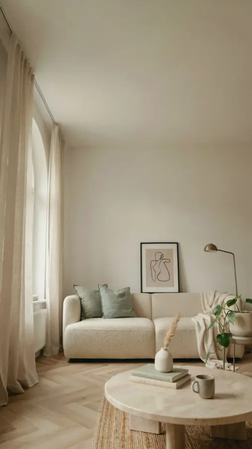
When I first set out to decorate my living room, I bought a cozy living room wall art set similar to this boho retro hand-drawn collection. I thought it would be a quick fix. Instead, I made every mistake in the book. The sage leaves ended up looking washed out against my olive couch. The terracotta prints sat crookedly above my reading nook, and I ended up with a whole pile of frames that didn’t match. If you are considering a digital download of 20 printable illustrations in cream, sage, and terracotta, you can skip my blunders. This guide walks you through the most common pitfalls when styling wall art, and how to avoid them so your space actually feels warm and inviting.
Mistake #1: Choosing prints that clash with your existing furniture
You fell in love with the boho retro vibe, but your sofa is a deep navy and your rug is gray. That soft sage and terracotta palette can still work, but only if you pull one of those tones into your existing decor. The biggest error I see is people buying a printable wall art set without first checking their room’s dominant color. Place a sample print (you can print one small version on plain paper) against your wall. Does it pop or fade? If your walls are already sage green, choose prints with more terracotta and cream to create contrast. If your space is neutral, you have free reign. The key is to let the art complement, not compete.
Mistake #2: Hanging art too high or too low
I once hung a print so high I had to stand on a chair to see it clearly. That is a classic mistake, especially above a sofa or in a reading nook. The center of your wall art should be at eye level, which is roughly 57 to 60 inches from the floor. For above a sofa, leave 6 to 8 inches between the top of the sofa back and the bottom of the frame. For a reading nook with a low armchair, adjust slightly lower so you can enjoy the artwork while seated. Mark the wall with painter’s tape before hammering any nails. It saves you from a dozen pinholes.
Mistake #3: Overlooking the power of a cohesive gallery wall
This art set comes with 20 hand-drawn prints, so you have plenty of options. But throwing them all on the wall without a plan creates visual chaos. A common mistake is mixing vertical and horizontal orientations randomly. Instead, decide on a layout before you print. I recommend picking 5 to 7 prints for a single focal wall, then arranging them on the floor first. Use newspaper cutouts to test spacing on the wall. You can group three smaller prints in a grid above a sideboard, or create a salon style cluster around your reading nook. Keep the frames consistent (more on that in a minute) and leave about 2 inches between each piece.
Mistake #4: Using the wrong paper or printing method
A digital download is only as good as the way you print it. I learned this the hard way when my first batch came out looking like office memos. Here is a quick list of what to avoid and what to choose:
- Avoid standard copy paper. It is too thin and curls over time. Use a matte cardstock (at least 200 gsm) or a fine art paper for that hand-drawn feel.
- Do not use glossy photo paper. It will reflect light and kill the soft, feminine boho vibe. Stick to matte finishes.
- Skip the office printer if you can. A local print shop can give you richer colors and sharper lines for a few dollars more.
- Test with one print first. Print a single illustration at home on plain paper to check the scale and color. Then take the digital file to a professional printer once you are happy.
A good print can make your wall art look like an original. A bad one will make it look like a last-minute Pinterest fail.
Mistake #5: Ignoring scale and proportion
Your cozy living room wall art set includes a mix of sizes, but you need to match the print dimensions to your wall space. A common error is choosing a tiny 5×7 print for a large blank wall. It gets lost. Above a sofa, aim for a group of prints that together cover about two-thirds to three-quarters of the sofa’s width. For a reading nook corner, a single larger print (like 11×14) can anchor the area. Measure your wall area first. Then use the digital files to
#bohoretro #livingroomdecor #printablewallart #cozychic #digitaldownload
Leave a Comment