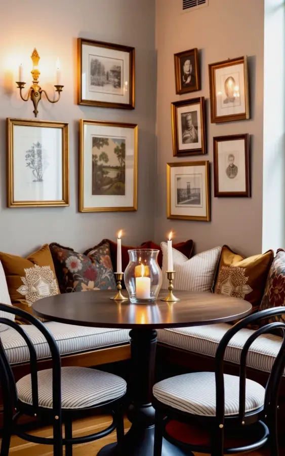
There’s a particular kind of nook that makes you slow down mid-step. The round dark wood table sits low and solid, and the black bentwood chairs look like something from a painter’s studio, except for those white and gray striped cushions. Honestly, this is the cozy dining nook I keep coming back to in my head. But here’s the thing: most people try to recreate this exact feel and end up with a stiff, awkward corner that nobody wants to sit in. So let’s talk about the common mistakes, and how to avoid them, using this exact built-in banquette and gallery wall as our example.
Mistake #1: Cramming the Banquette Into a Corner
I get why you’d push a built-in banquette flush against both walls. It seems like the natural move. But look at the photo above: the banquette runs along the wall with a little breathing room, and the table still gets to stand front and center. When you cram seating into a tight corner, you end up with a diner booth that nobody can actually slide out of.
Instead, give the banquette a little distance from the side wall. Let the table’s curve extend past the seat cushion. That tiny gap is what makes the nook feel open rather than boxed in. Your legs will thank you, and so will anyone sitting on the inside.
Mistake #2: Choosing a Table That Looks Good But Eats the Room
A round table is the unsung hero of small dining nooks. The one in the photo is dark wood, substantial but not massive, and it anchors the space without crowding the banquette. A square table can work, but it brings sharp corners into a spot where people are already scraping chairs around. Round just makes sense.
The common mistake is falling for a table that’s too big because it looks dramatic. Measure your nook, then subtract at least 12 inches of leg room on every side. If you can’t scoot your chair out and stand up without hitting the wall, it’s too large. This small, simple rule has saved more dining nooks than any other piece of advice I can give.
Mistake #3: Designing a Gallery Wall That Feels Like a Waiting Room
Notice how the gallery wall above mixes botanical prints, landscape drawings, and vintage-style portraits, all in gold frames. The frames unify everything, but the subjects tell a looser story. That’s the trick. A gallery wall becomes a waiting room when every frame is the exact same size, hung at identical intervals, all featuring the same style of art.
Here are a few things that work better:
- Use a mix of small, medium, and large frames, but keep the finish similar (gold, black, or natural wood).
- Arrange everything on the floor first and photograph it, so you can play with spacing without making a dozen holes.
- Throw in one odd piece, like a tiny charcoal sketch or an old family portrait, to break the monotony.
The brass three-arm sconce with lit candles is the real genius move here. It’s not a painting, but it occupies the wall in a way that gives the whole arrangement depth. Treat lighting as part of the gallery wall, not as something separate.
Mistake #4: Forgetting That Lighting Is Half the Warmth
Look at the glow in that photo. The candles on the brass sconce are doing way more work than any overhead light could. A single ceiling fixture, especially a bright one, flattens the whole nook and washes out the gallery wall. What you want is warm, low light that pools on the table and makes the gold frames shimmer.
A pair of wall sconces is a classic choice, but even a small table lamp with a dim bulb can transform the corner. The goal is to create shadows, not eliminate them. Shadows are what give a nook that collected, grown-up feeling. This is the difference between a room in a furniture catalog and a warm interior that actually looks lived in.
Mistake #5: Picking Cushions and Pillows That Are Too Safe or Too Loud
The banquette here has a white base cushion, which sounds risky, but the pillows tell the real story. Brown, burgundy floral, and gray striped prints sit side by side without clashing because they all share a slightly muted, old-fashioned palette. The mistake is buying a single matching set of cushions in one print. It’s fine when you’re 22 and renting your first apartment, but it won’t give you this layered, collected feel.
Mix two or three patterns, but keep one common thread. Maybe they all have a similar background tone, or they all feel rustic and faded. And don’t forget the practical side. White cushioning needs a removable, washable cover, or you’ll be dry-cleaning after every coffee spill. This is one of those moments where style meets common sense, and common sense should win.
Mistake #6: Over-Staging the Space So No One Actually Wants to Live In It
Not gonna lie, there is such a thing as being too neat. When a dining nook looks like it’s only for taking photos, people will avoid it. The nook in the photo feels like someone just stood up from the table and left their coffee cup behind. The pillows aren’t uniformly fluffed. The chairs are a little pushed out. That imperfection is what makes it inviting.
So don’t arrange everything with surgical precision. Leave a stack of magazines on one end of the banquette. Put a small ceramic bowl on the table with some fruit or, honestly, a few crumpled napkins if that’s what happened. Let the space tell a story about actual meals and conversation. A nook that looks used will get used.
This whole corner works because it feels like a series of small decisions, not one perfect plan. The dark wood, the scalloped bowl, the slightly crooked portrait frame, the candles that are halfway burned down. That’s the energy you’re going for.
If you’re planning your own dining nook, start with the banquette and the table. The gallery wall can come later, piece by piece. And for the love of good lighting, don’t rely on the overhead fixture. Save this post for when you’re ready to pull the trigger, and I hope your corner feels this warm and collected.
Leave a Comment